Remember, remember, the fifth of November 2020 - a key date in both economic policy and personal branding, two things that operate in a Venn diagram populated by a man whose year cannot have gone as imagined on January 1: Rishi Sunak.
So what did Dishy Rishi do on Guy Fawkes Day? This.
You can find critiques of the furlough scheme extension - the eighth incarnation of Covid job support so far - elsewhere. We’re going to be focusing on this.

It’s the Tory Tree, but with the Chancellor’s name. It almost certainly does not feature in the Conservative’s brand book, and even if changing the copy were permitted in said book, this is the wrong font, in capitals, and in two weights. It’s a mess. So what happened? Let’s have a look.
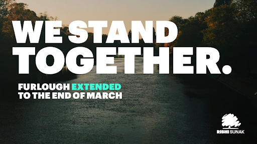
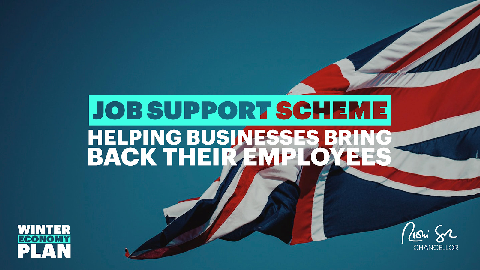
For a certain sort of person, Rishi’s surprising personal brand is something of an icon of lockdown v1. Remember this?
I consider this peak Brand Rishi. The signature logo, classily captioned with “Chancellor”. A photo signifying seriousness but optimism; progress but - I dunno, there’s still too much concrete in it, TBH. The tracking on “WE STAND TOGETHER” neatly pulls focus to the green tie (green shoots!). Or is it turquoise? The palette otherwise is tidy and contemporary.
It is not, however, Conservative. Where’s the blue? Where’s the word “Conservatives?” What’s the font and why isn’t it whatever the Tories use? Compare and contrast:
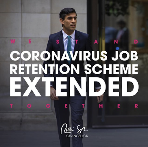
Same announcement, same time, both on Instagram. The Conservative account picks out the blue of an august institution, makes the copy massive and drops its logo in the corner. Rishi includes the WST tagline, more copy (to make the template work?) and - well - his face. This time the copy awkwardly frames his mouth. Still, though, it’s better than his party’s attempt.
It’s not surprising that Rishi has invested in his personal brand; he needed something to push back at his boss. Sunak succeeded Sajid Javid, who resigned / was booted out just two months into the job after Boris Johnson (or Dom) fired all his advisors in a massive re-shaping of the power balance between Numbers 10 and 11.
But political power can be derived from fame, not just the size of your pretorian guard, and our 21st century politician is earning that from social media clout, as well as bribing people to have fun in the unfortunately named (but equally branding-heavy) “Eat Out To Help Out”. He even got his mug splashed across the nation’s Wetherspoons:
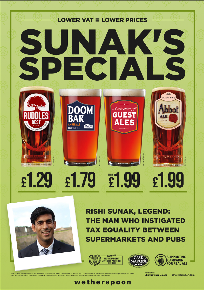
The design itself (of Rishi’s stuff, not Tim Martin’s) seems to be templatised from Canva, an online design platform used by small businesses and influencers. At least, they also make heavy use of the geometric font in Rishi’s posts, ITC Avant Garde. Rishi’s face soon became nationally recognisable - as did his £180 electric mug (and I mean mug this time) - and sure enough, the rumours started. Would he take over the top job? Or rather - when would he take over the top job?
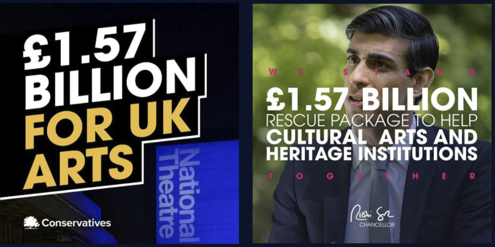
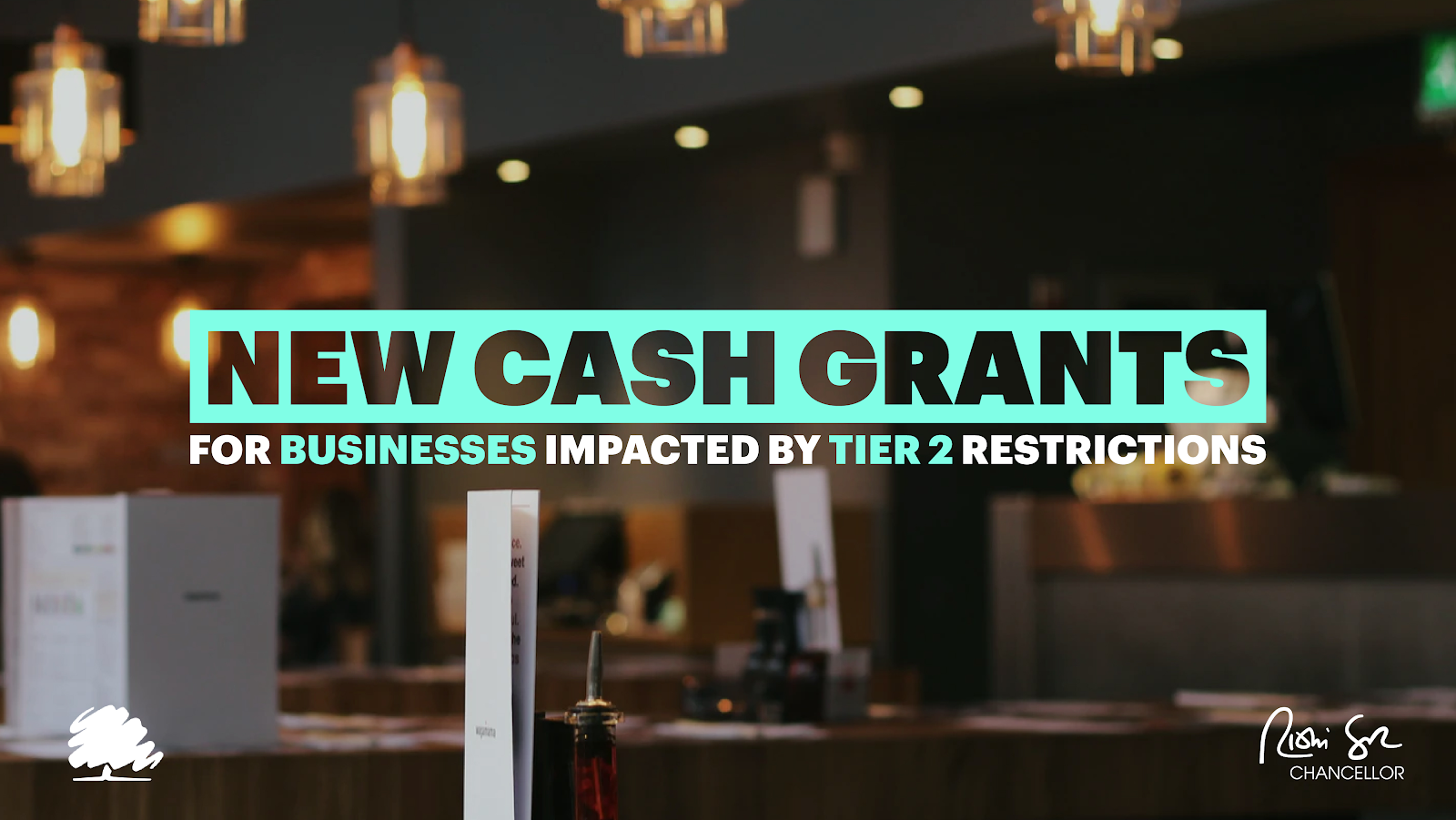
So, it appears, words were had. First Rishi’s face disappears, to be replaced by a more classically Conservative image:
(Albeit still a classy one - notice the vignetting, the nice palette; it looks like Unsplash). Then: the tree appears.
They should have stopped here: the scribbly tree balances quite neatly the scribbly signature, which has itself gotten smaller. But was something not right? Rishi doesn’t look convinced:
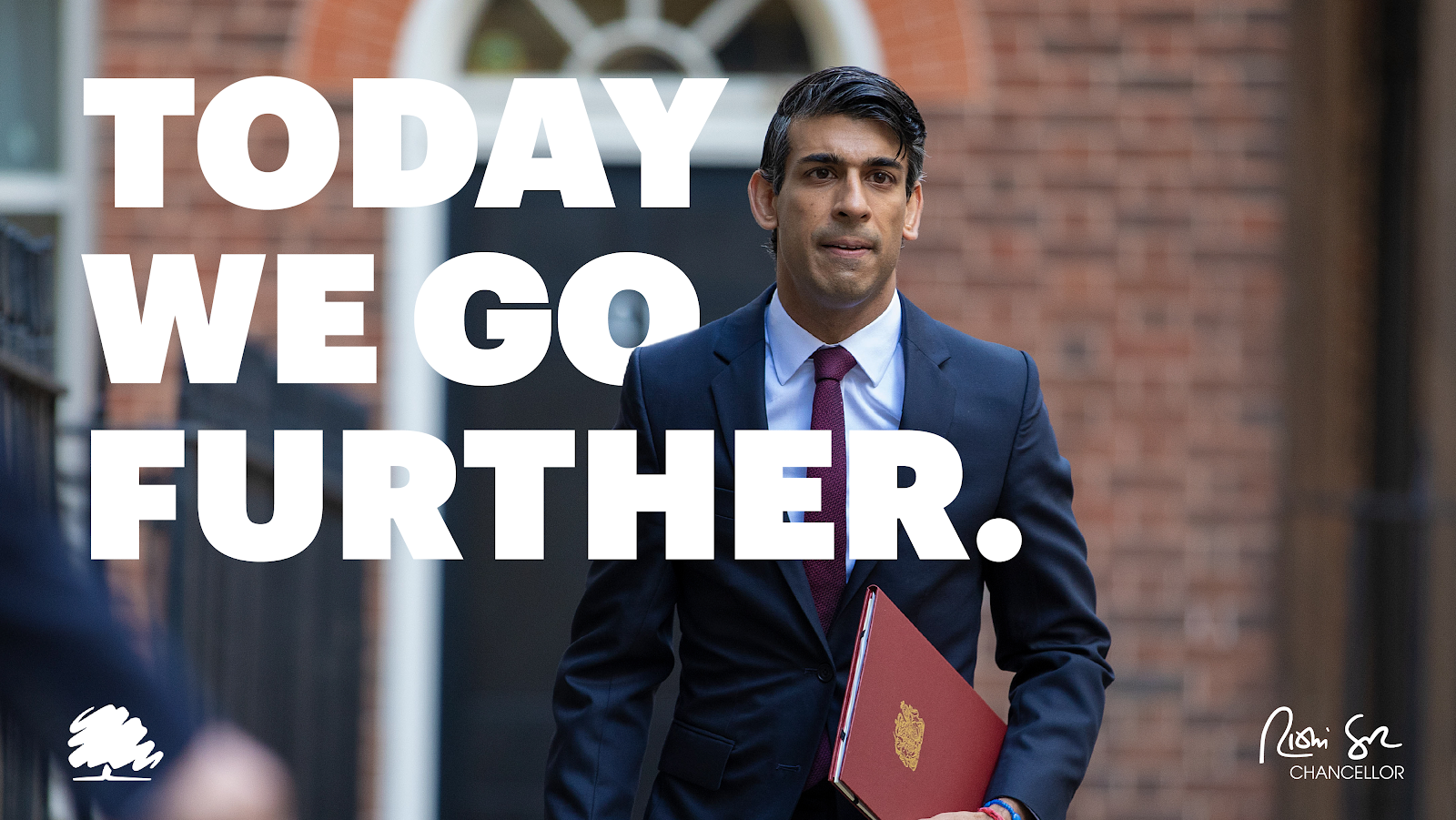
(That day, by the way, they went nowhere - basically scrapping the first Job Support Scheme and replacing it with another one, which would last for all of two weeks).
And then - other Tories get in on the act. ICT Avant Garde + signature =
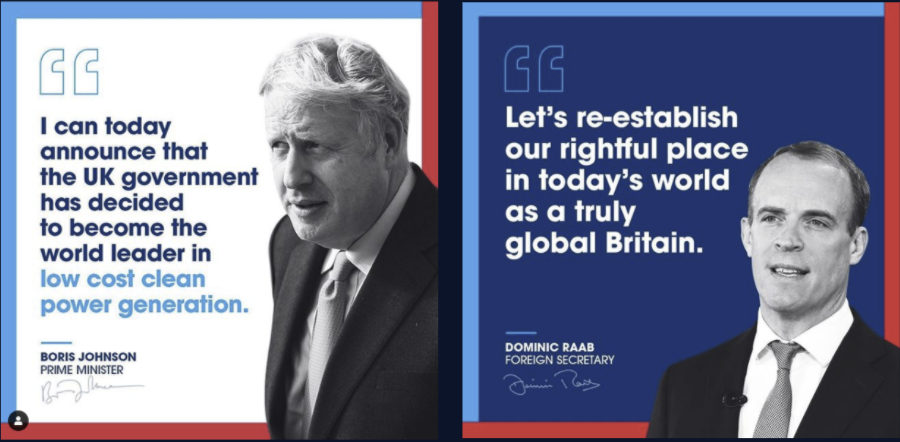
Is this what prompted the re-brand? When your competitors catch up, you need to keep differentiating. Still, back to this - it’s a mess, isn’t it?
What is a dark river saying? Where’s the “we”? What happened to the clever layout? This looks heavy and depressing. And no signature - where’s the personal touch?
And now - this. Spot the difference?

What are we to make of these nuanced design changes? Is the Kremlinology of Downing Street really reflected in logo alterations? Or is this just a perpetual search for perfection, in line with the Eight Stages of Furlough? Either way, if you’re a budding cabinet minister, get yourself some templates as sharp as your elbows. Thanks PM!