What's been my biggest goal as a copywriter? To write a novel longer than War And Peace? Of course. To develop a TV script that turns into a Netflix five season sensation? Naturally. Create an ad campaign with zero copy? Hell yeah.
I'm not afraid to say it. There's nothing I adore more than an ad that barely needs any words. It doesn't mean that a lot of thought and craft hasn't gone into the meaning (or that your copywriter is a lazy good for nothing). In fact the very opposite. Because you've achieved the incredible feat of not needing to spell out the idea to your audience.
Way back at college we learnt about semiotics, the world of symbolism and implied meanings. The signifier and the signified. Words are just a tiny slice of the signifiers we can use to our advantage in media. Editing, lighting, fashion styling, casting, graphic design, colour palette, photography, animation, film, illustration, music tracks, coding, UX and media space context all spring to mind, just to name a few.
All these aspects require the same rigorous thinking as copywriting. They all require a strong strategy. A defined tone of voice. You can express all of these things without needing to add any words. Even more amazing are those moments when you can showcase the product without needing to put the logo in the corner.
Isn't that just fabulous art direction?
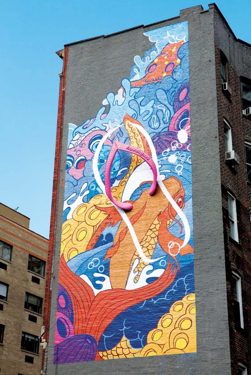
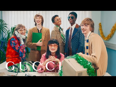
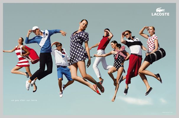
Yes. That too has to be part of the deal. Fashion, make-up and beauty brands are strong proponents of this strategy. Showcase the gorgeous product and project the brand's aesthetics through all semiotic avenues available. Gucci, Havaianas, and Lacoste are my personal favourites.
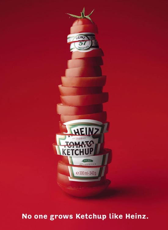
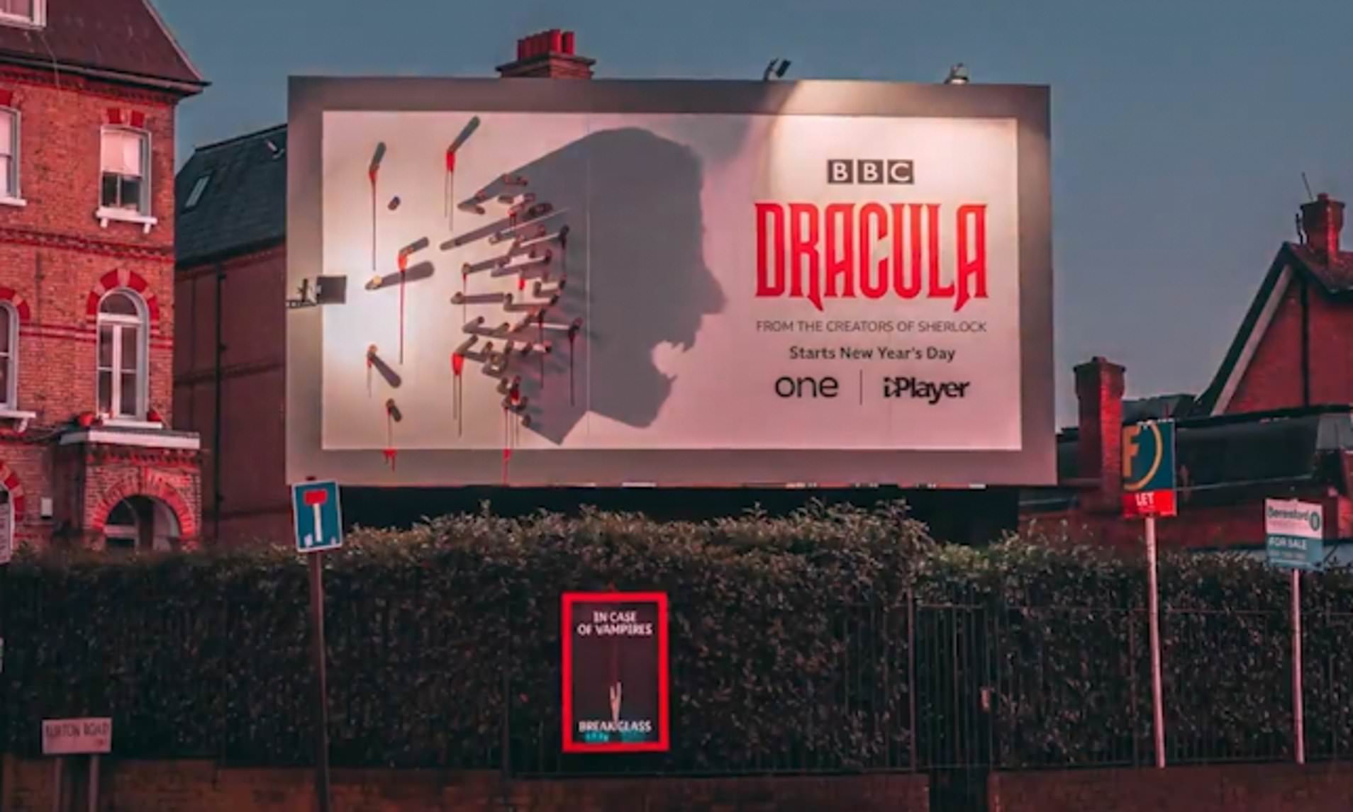
Heinz always provides a masterclass. (How many of us know at least five creatives who claim they made the chopped tomato ketchup bottle ad?). In the ad I'm showing you there is indeed a line of copy, but I've seen posters with zero copy pre-awards ceremonies. Solid Guinness OOH rarely needs a copy line, and it's always great to see when teams don't feel pressurised to add one. Finally and most recently, BBC's Dracula poster won hearts and minds for clever shadow work. Technically, yes, there is body copy, but it explains when and where to watch the show.
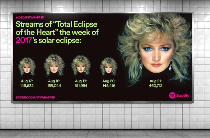
So what happens when you're not simply showcasing a luxury aesthetic, but a self-publishing or streaming and communications platform? We've seen YouTube's Creator project create great long-term positive traction. Meanwhile, Spotify spotlights playlists and user stats to their audience's delight. In both these two cases we're seeing ad campaigns being used to amplify original voices. In other words, the creative teams are busy doing something different but equally complex: curating.
Creative curation
There's a fine line between amplifying and censoring. Without extreme care and direct communication with marginalised communities, valuable content can be overlooked or misrepresented. In these moments, creatives are not required to layer up fictional worlds or interpretations featuring copy or art direction. The creative's job is to hold the space for someone else to shine in it.
Sub-lines aren't always needed to labour home a product point. I'm in awe of creative teams who don't need to put a short sentence about a product's technical capacity on a poster. Yes, it’s a joy to see it done well. It’s craftspeople excelling at what they enjoy. But I do love to see a product so integrated with all of the semiotic components of a media communication, that they can have the confidence to drop the copy. The creatives and clients have expressed their confidence in their audience, who in return understand what the creatives and clients were trying to achieve. Which actually implies all three points of the communication triangle are humming away in tune.
Some people would say, these are just brand ads. It's easy peasy to make glossy brand ads, they're big and vague and don't work hard before scooping up all the fancy awards. I'd argue the contrary. How many brands don't know what they're doing or where they're going in 2021, given the environmental and socio-political context? How many times do the trinity of clients, creatives and audiences not align, thus not allowing a brand ad to fly? I'm going to bring up Pepsi Max starring Kendal Jenner as an example of good intentions dissolving into something much stranger.
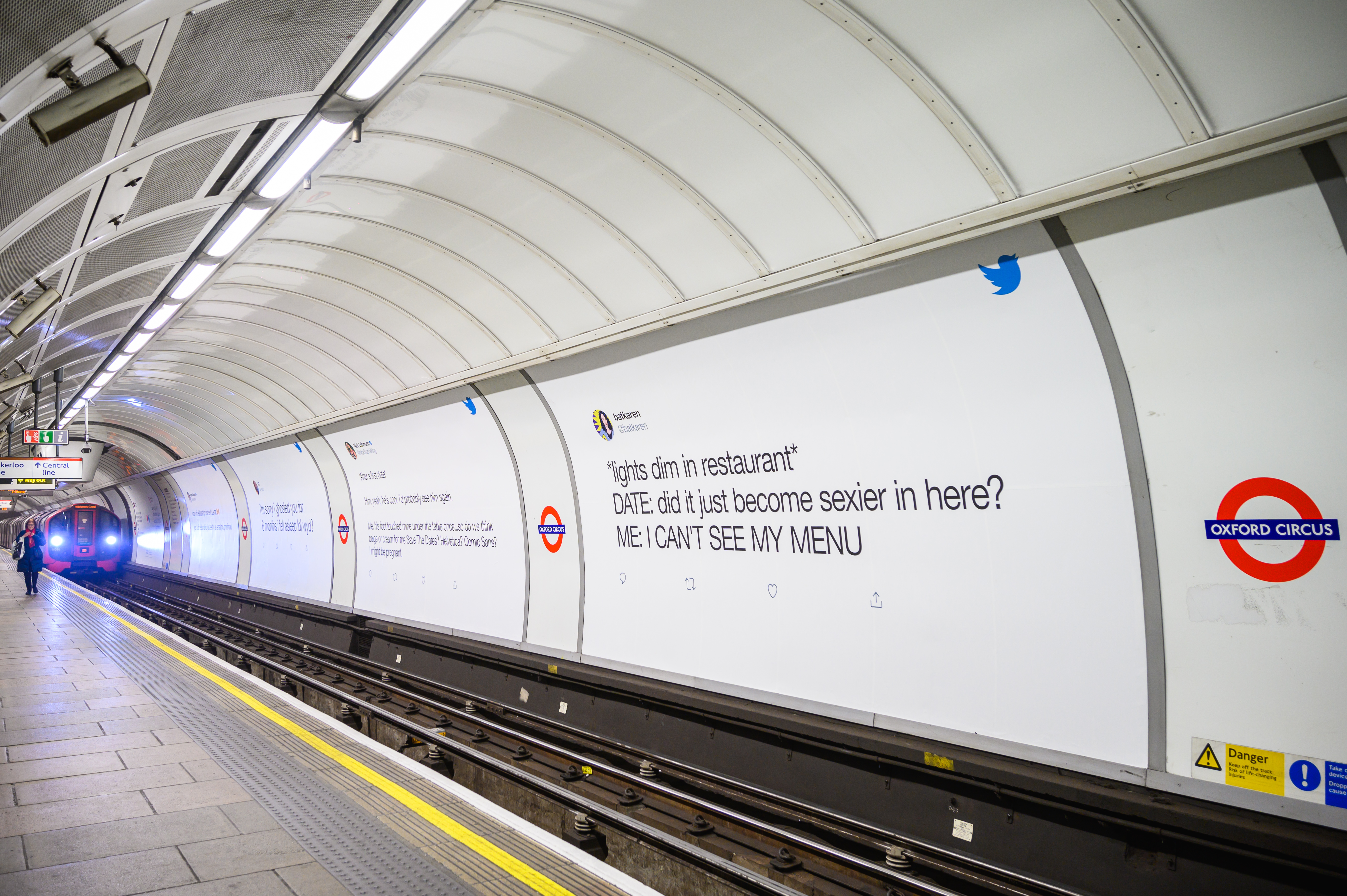
Our Dating Twitter OOH campaign 2020
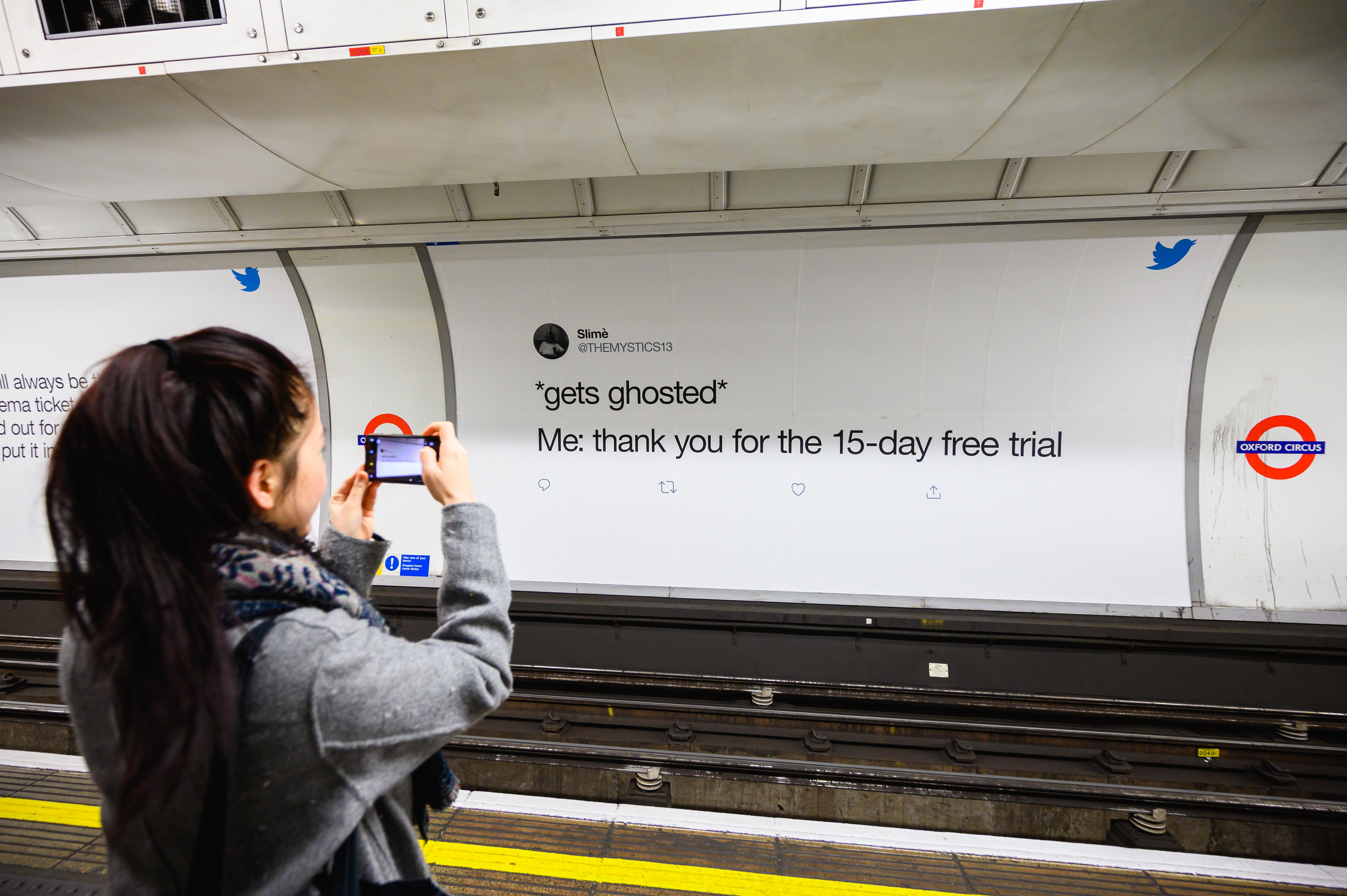
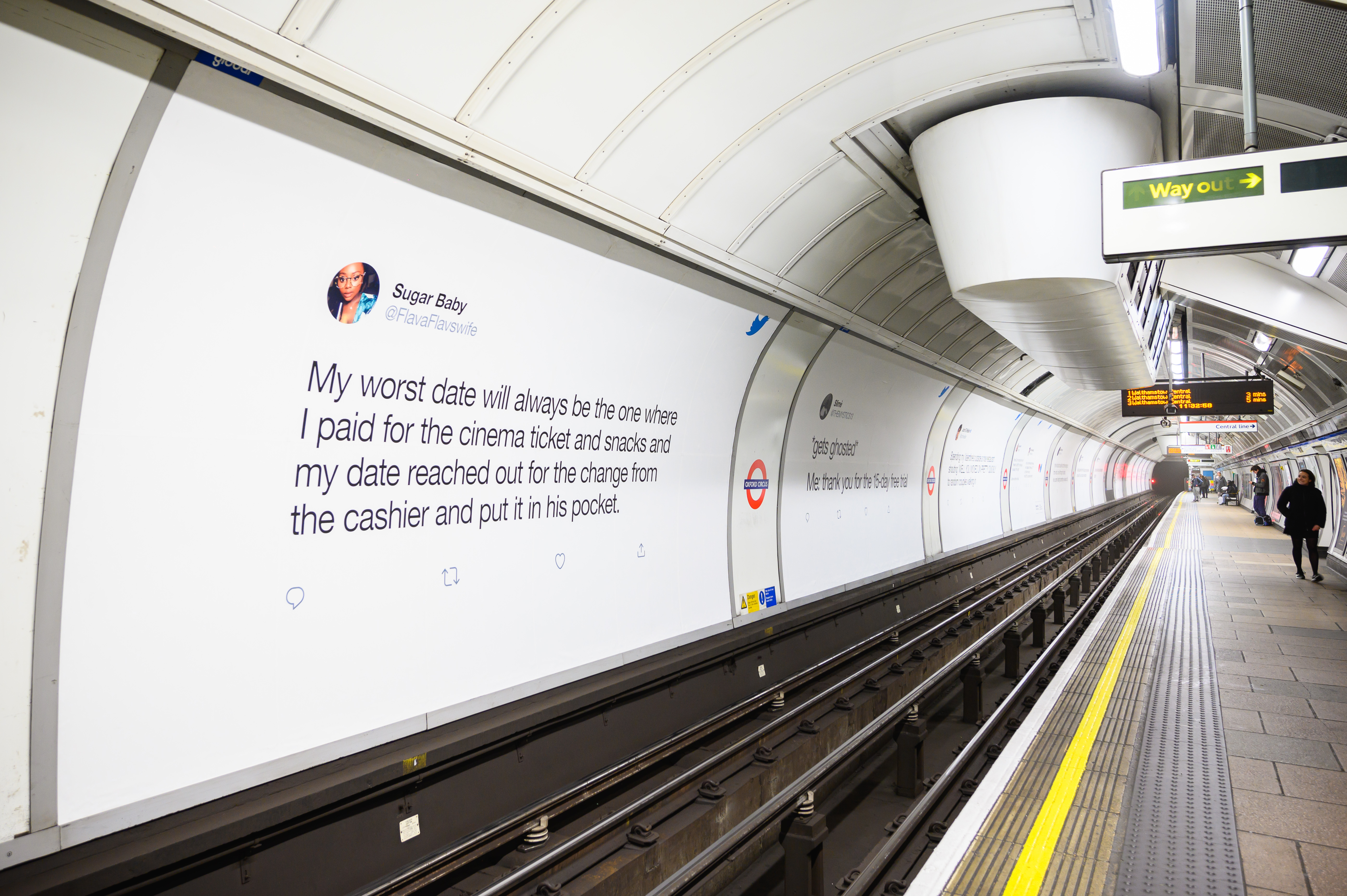
This is why it was with great relish that we created Dating Twitter, a global OOH campaign without a 'tagline'. Here in the UK, it ran alongside our award winning Twitter Dating Advice Bureau, located in Covent Garden. With such a huge media placement, knew we had a real opportunity on our hands. It was a moment to step back from adding some copy 'just to make sure everyone gets it'. Why? Because the copy ... already exists in the form of the Tweets. If we were to add layers of fiction and 'creativity', we'd be blocking their light. On a semiotic level, our activity would contradict the very benefit of the product.
By showcasing dozens of hilarious tweets about dating without adding layers of our own creative interpretation, we showcased the product in its complexity. That is, the diversity and wit of users free to exist in an open and accepting space. Twitter's brand values were also expressed in the minimal approach to our OOH graphic design. Meanwhile the brand's support for diversity and inclusive attitudes were communicated in its well funded media plan. Twitter bought out four complete London (UK) tube platforms, and transit placements across New York, San Fransisco and Seattle (USA). By launching the campaign two weeks before Valentines Day, we achieved maximum saturation. Twitter's voice was heard loud and clear, but not by shouting with copy.
Sometimes it’s important to let other people do the talking. Stand back. Let the brand breathe. Let the product users speak for themselves (and I'm not talking 'real people' who've been heavily edited). We don't always need to add layers and layers of our own creative opinions onto a campaign to make us feel in control. Or to confirm that creativity is a part of our identity. My tutor told me "That's what your novel is for".

