When it comes to marketing digital products, there’s one major pitfall most brands are keen to avoid. Messaging that leans into the tech and away from the human heart of the product risks coming across as cold and alienating. Steering clear of this, though, is easier said than done.
At Flying Object we work with a lot of tech companies, and we’re proud to create campaigns that celebrate the impressive technology behind these brands, without forgetting the real people they need to speak to. Here’s a recent example, and some thoughts on why it works.
We were recently asked by tech company Onfido to create a piece of video content for the homepage of their website. Onfido build technology that enables businesses to verify people's identities remotely using photo-based identity documents and artificial intelligence algorithms. These are used by companies like banks to set up new accounts.
The tech behind this product is complex, but the value it offers its customers is simple: Onfido allows businesses to feel safe and secure in the knowledge that they’re interacting with genuine, verified customers. This is the story we needed to tell, cutting through the world of digital identity banking which could easily be viewed as cold and off-putting.
Here are some of the ways we went about it:
-
Feature real people
When you’re explaining a complicated product, it can be tempting to rely on abstract visuals and explainer graphics. But making sure to include humans and familiar objects from the everyday saves the world of the campaign becoming too cold and digital.
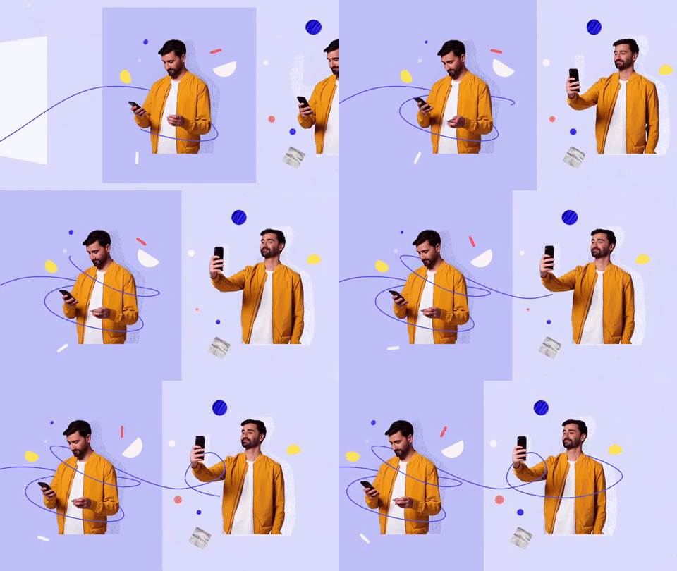
Onfido’s existing brand photography was based on warm, friendly-seeming portraits of real people. We chose to make use of these assets, and combine them with a refined but lighthearted style of animation. This allowed us to create an inviting world filled with characters that customers can relate to.
-
And real textures
Developing our art direction, we made use of tactile, material textures to reinforce that human centred approach. Paper, wood and other recognisable elements from the real world ground the designs and help avoid an overly digital feel.
Our animation style brought in elements of collage, and played with space, depth and perspective to ensure a living, authentic feel.
When we want to bring illustrations to life, and pull back from that flat digital aesthetic, boiling is one of our favourite animation techniques to use. It’s that textured wobble you see in moments like this:
-
Bring the fun
How better to counteract tech’s association with dry info and obscure messaging than by infusing a big dollop of fun into your content?
We made sure Onfido’s video was exciting and dynamic, by making sure movement was a central component. We borrowed the continuous blue line that features in their brand identity and built it into an animated motif representing Onfido’s role, drawing the scenes and reforming as the narrative progresses, connecting and uniting the other elements.
We made sure the line was organic and energetic, moving in a characterful style and varying in dimension, rather than uniform and vectored as you might expect from a digital product.
We love proving tech doesn’t have to be cold or difficult to understand, and we love working with brands who need help telling their human story. If this sounds like you, we’d love to connect.


